Typesetting services
We typeset text-heavy novels to complex 1000+ page academic textbooks, formatting text and content ensuring it is accurate and consistent, using software from Adobe, Quark and Office. We learn quickly about how a design or document is put together, good typesetting enriches your content, communication, and product’s value. Our expert typographic knowledge, understanding of editorial style and eye for detail, is also a natural benefit. If there are any unresolved issues, we make a list, then send them to you. Our turnaround times are prompt or they are set by you, and we regularly typeset books, journals and publications for major book publishers and organisations.
Information standards, quality, and consistency
We do
- Mathematical, chemical and scientific equations.
- Reformat and conversion of old QuarkXPress files into Adobe InDesign or Microsoft Word.
- Expert typographic and typeface selection advice.
- Footnotes, endnotes, quotations.
- Micro-typography (justification, kerning, leading, tracking, hyphenation, superscripts/subscripts).
- Fix of widow/orphan words and cleaning text rags.
- Prepress preflight (remove unused spaces, fonts and swatches).
- Setup to printer’s specification (bleed and crop marks, PDF preparation, colour profile management).
- Tables (including decimal point alignment in numerical data).
- XML (Extensible Markup Language) tagging and export.
Below is a selection of projects to give you an idea of just some of the projects we have worked on.
Client
Intellect Books.
Project title
Directory of world cinema: Turkey.
Book type
Film directory, reference.
Services
TypesettingCorrectionsTypographic design.
About the client
Independent academic publisher for teachers and researchers in the arts, media and creative industries. They publish over 100 journals and around 100 books each year.
Client’s needs
The client needed this world cinema directory, typesetting exactly the same as the rest in the series, in a variating 3 column layout. The directory featured different types of information like text, photographs, foreign text extracts, references, 4 heading levels, and notes using superscripts.


Outline of what we did
We typeset this 215-page directory and turned around a 1st proof within 1 week. We amended a large amount of corrections from the editors. The text also included many Turkish specific diacritic marks, and some were not available in the typeface specified and had to be put in manually, using the standalone diacritic marks and kerning.
3 main improvements for them
- Typeset and amended editorial corrections from staff and authors.
- Increased product quality by using best practice expert knowledge and technical experience.
- Setup for high-resolution CMYK printing on uncoated paper, using the colour profile.
Details
Pages: 215Page size: width 170mm × height 240mmInside paper: Explorer Offset, 90g/m².
Enabled sequential success
Client
Oxford University Press.
Project title
Incredible English, teacher’s book 2, 2nd edition.
Book type
English language teaching (ELT).
Services
TypesettingCorrections.
About the client
The largest university press in the world, with more than 6000 staff, and a presence in 52 countries.
Client’s needs
This worldwide academic publisher needed a diverse range of content handling and typesetting, ranging from icons, images, tables, dingbats, to many heading levels.
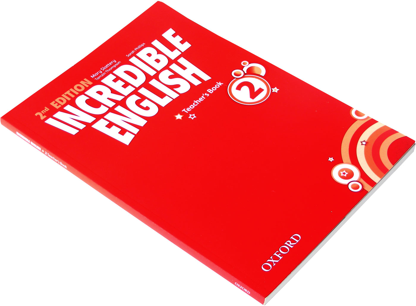


Outline of what we did
We typeset this book exactly as specified in their detailed and extensive brief and typesetting notes. We avoided widow/orphan lines at the top and bottom of columns. There was a large amount of paragraph and character stylesheets, along with nested styles, and various symbol and dingbat typefaces. We were also instructed to use the publisher’s custom Adobe InDesign scripts, to reduce typesetting time. The manuscript from the editors also had various coding tags, that when imported in, were changed to their corresponding Adobe InDesign paragraph and character style. The editors for this title used Adobe InCopy, and any overflown text was linked into a text frame on the pasteboard, so the editors could still get access to the text. We produced a final printer-ready PDF for this book with a minimum amount of fuss.
3 main improvements for them
- Accurately formatted content to the client’s specification.
- Decreased staff time needed in the office to produce the book.
- Managed the typesetting, amended editorial corrections from staff and authors, setup the final book PDF to the printer’s specification.
Details
Pages: 176Page size: A4: width 210mm × height 297mmInside paper: unknown, 80g/m².
Turned around simple complexity
Client
BioMed.
Project title
Medical imaging, 5.
Book type
Medical, scientific.
Services
Journal cover designJournal designTypographic designTypesettingPaper research and sourcing.
About the client
Scientific open access publisher that has an evolving portfolio of some 300 peer-reviewed journals.
Client’s needs
This journal required demanding, complex and accurate typesetting. The content needed support for Greek characters, superscripts, subscripts, different numerical alignment styles, equations, mathematical and scientific symbols.


Outline of what we did
We chose and recommended 2 typeface families that would get the job done. The book featured many tables, that we setup an appealing table style for, really enhancing them into an enjoyable feature of the journal, rather than typically under‑designed, dull and boring. We decided to use no hyphenation on the ranged left text setting, to avoid splitting and hyphenating complex long medical words and terminology, that could further lead to confusion. We also made the x-height of the 2 different typefaces match within the stylesheets, for a consistent typeface weight appearance. The content also featured complex typography that included superscripts, subscripts, Greek characters, mathematical symbols, and complex equations.
3 main improvements for them
- Improved layout readability through better use of white space, precise vertical typographic composition, and well-designed parts.
- Used typographically equipped academic typefaces that support Unicode, Greek characters, scientific symbols and mathematical equations.
- Well designed, setup, clearly named, and easy-to-reuse Adobe InDesign and Adobe Illustrator templates.
Details
Pages: 184Page size: A4: width 210mm × height 297mmInside paper: Croxley Heritage Wove, ivory, 120g/m², 75% recycled. Cover paper: metallic (brand unknown).
Provided a painless remedy
Client
Boydell & Brewer.
Project title
The civil wars after 1660: Public remembering in late Stuart England.
Book type
History.
Services
TypesettingTypographic designCorrections.
About the client
Publishes history books and critical works based in England.
Client’s needs
The publisher provided the information in Word documents, they provided a template, and we were required to typeset this tricky book. Before the 1st proof was made, they needed a quality control check of footnotes, because it is time consuming and problematic to correct, at a later date.


Outline of what we did
The book needed accurate typesetting with 100s of footnotes. We were careful to double‑check all footnotes, to make sure they were on the same page as the footnote reference in the main body text. A number of template improvements were also made, like an increase in the amount of leading making the text easier-to-read, and better vertical spacing of the text. The main body text typeface the publisher instructed us to use, did not have properly drawn superscript characters, thankfully, there was a semi-bold weight of the typeface available. We used that just for superscripts, so they render at the same weight as the main body text and do not print too light, that is better for readers with less than ideal eyesight or ageing. We expertly typeset this tricky and text‑dense book, giving readers a better chance of an effortless reading experience.
3 main improvements for them
- Accurate and precise typesetting with an error check stage.
- Made the text easier-to-read for people with ageing or less than ideal eyesight, improving the reading experience.
- Used consistent and precise vertical alignment for the different parts of the book and main chapter headings.
Details
Pages: 300Page size: Royal: width 156mm × height 234mmInside paper: unknown, 80g/m².
Gave their users an easier environment to think in
3 results of typesetting by us
1 Expert typography and layout that results in more consistent, professional and rewarding reading experiences.
2 Increased confidence and security because you know who is handling and doing your job (we do not outsource).
3 Less project time needed from you or your organisation, that helps you focus on the other important project aspects.
HUP 2, 3, 4! Stand to attention! Get your content inline NOW!
We make more of a difference than you think! We would like to know more about your project
Contact us