We offer a complete book design, illustration and production service, from manuscript to printer’s specification. We are knowledgeable about page layout, grid systems, image structures, typography, stylesheets and material considerations like colour accuracy, paper and binding. We analyse your content, optimise it to what it needs to do, striving for appealing books and high user‑productivity, valuing books as physical, functional and sensory objects. We enhance the graphic communication of your content, making the book enjoyable to use, and something people want to invest in.
Take them on an interesting journey
Categories of books we design
- Academic, medical, scientific, technical.
- Children’s, teenage, young adult.
- Design, art, cookery, photography, architecture.
- Textbooks.
- Fiction, non-fiction, novels.
- Picture books.
- Poetry.
- Reference.
Below is a selection of projects to give you an idea of just some of the projects we have worked on.
Client
Whitefox.
Project title
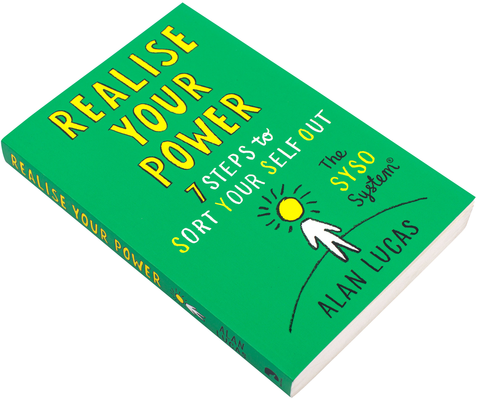
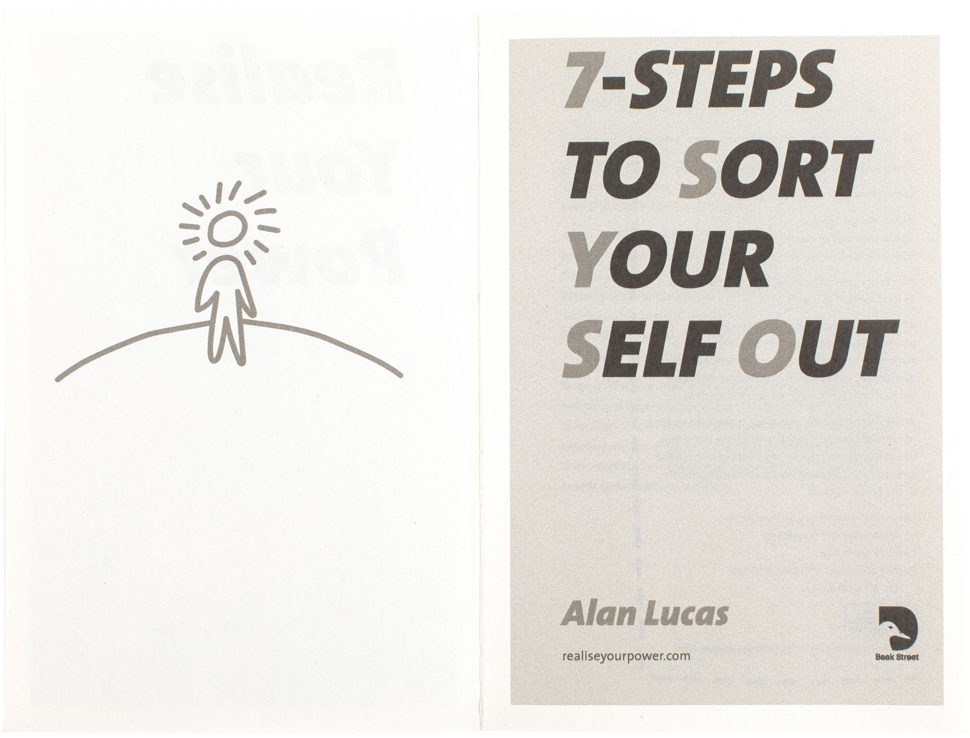
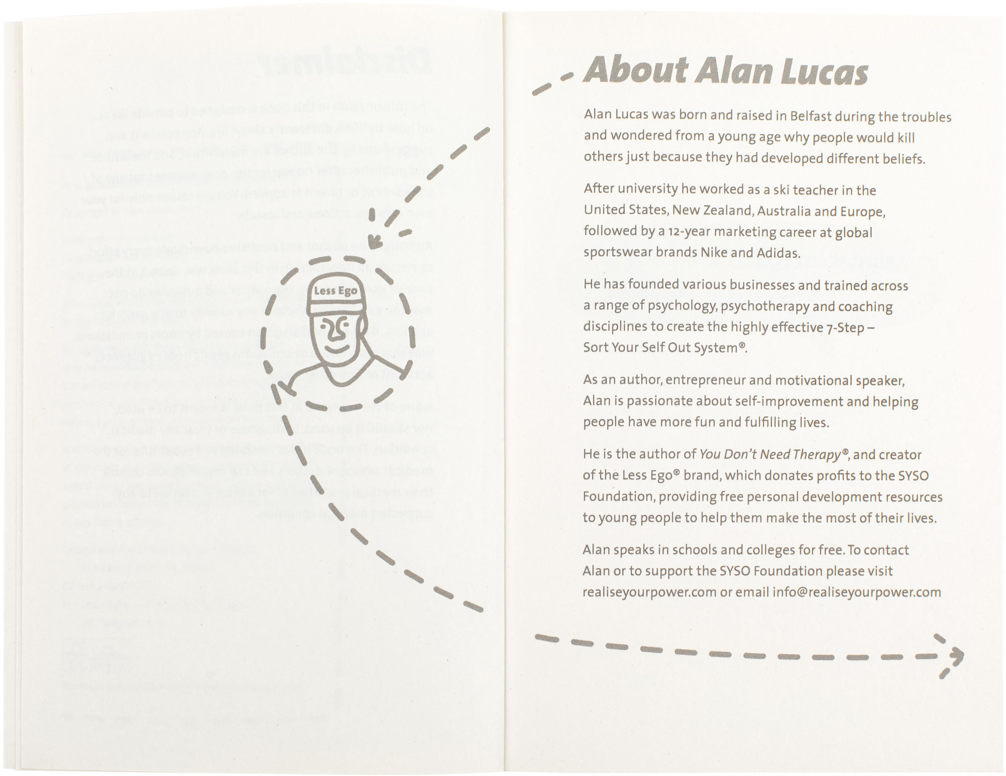
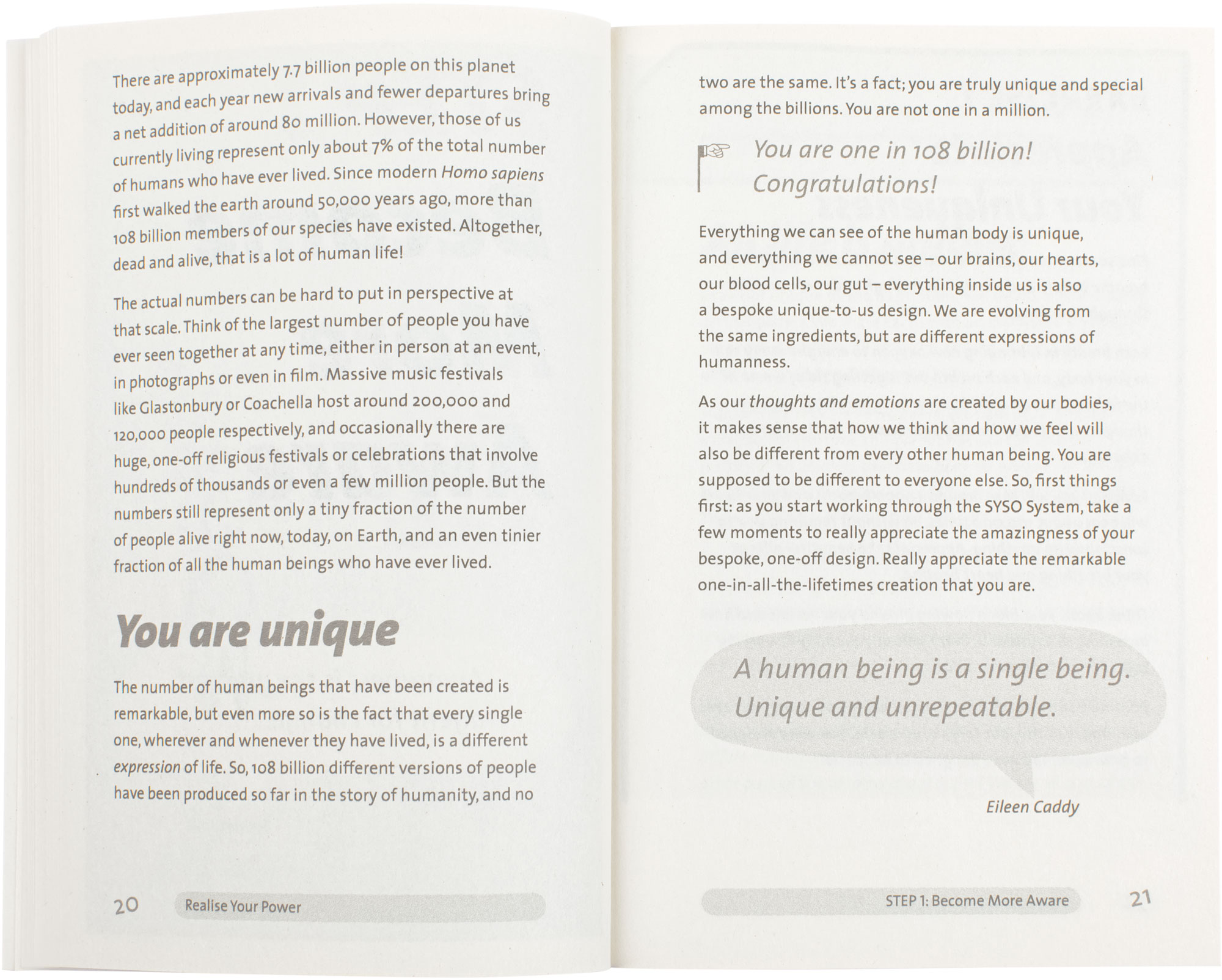
Realise your power. 7 steps to sort yourself out. The SYSO system.
Book type
Self-help, psychology.
Services
Book designTypographic designTypesettingCorrectionsFreehand illustration.
About the client
A creative, collaborative agency that exists to bring projects to life. A publishing partner who pledges the highest level of care and commitment, and our own decades of expertise across a range of fiction, non-fiction, adult and children’s.
Client’s needs
The author and publisher needed an easy-to-read, lively, fun, engaging and not typically academic book designing, illustrating, typesetting and setting-up for the printer.
Outline of what we did
We did an initial selection of designs, until eventually it clearly emerged that 1 design that was working best, that we developed more.
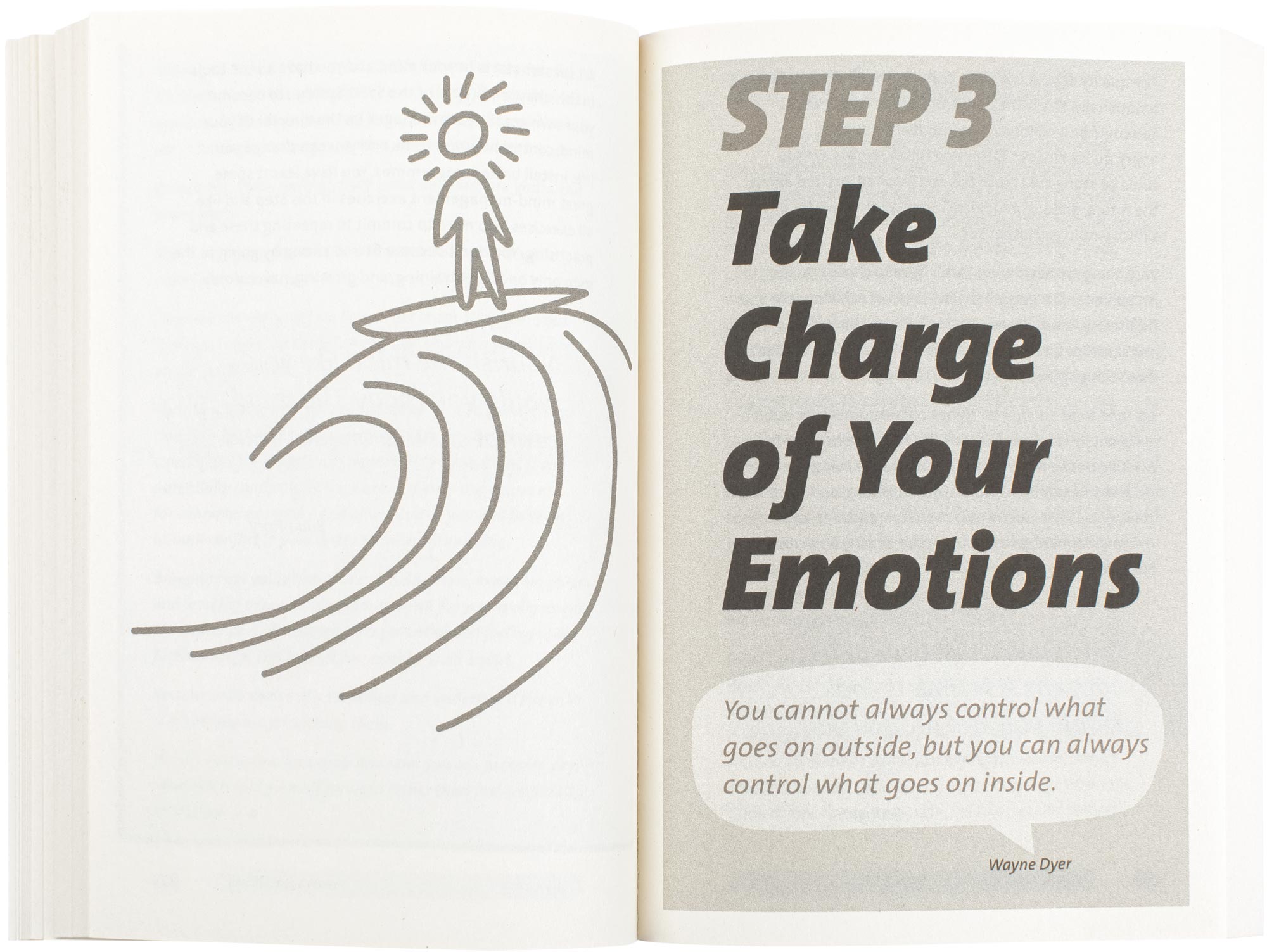
Standout aspects were chapter opener illustrations and large headings, fun bold italic headings adding a really fun and lively feel to the information (that is not often seen). Typographic reference devices for step parts within the book (that allowed accurate cross navigation), great overall design of the front and endmatter. Not too much text on pages, as to allow quick progress through pages. Quote devices to breakup and pace the text dense pages, more use of dark grey colour than default black (to offer something new and unusual). The few blank pages due to pagination usually left at the back of the book, were made into notes pages for readers, with rules mimicking ruled lined paper. The book cover also echoes and fits the design of the inside of the book, that is another huge benefit and bonus. And the modern near fluorescent green colour used, adds a really fresh modern feel.
This book is also quite unusual, in the sense that the design was dealt with quickly and without too much political interference. Usually this category of book get forced into a past title design and template, that is quick to produce, but not very effective for readers, or customised for the actual book’s neededs.
Another highly successful and satisfying project for all involved, where a lot of good decisions were made and allowed. That made this book a serious title to be noticed and read. Some people say they do not like self-help books, but if they help people and they get things from it, what is the issue…
3 main improvements for them
- Quote devices to breakup and pace the text dense pages.
- Fun bold italic headings, adding a really fun and lively feel.
- Convincing and confident book that will serve the book, for many years to come!
Details
Pages: 256Page size: width 129mm × height 198mmInside paper: unknown.
Powerful and convincing
Client
Royal Museums Greenwich.
Project title
Icons: The Armada portrait.
Book type
Art, history.
Services
Book designTypographic designTypesettingCorrectionsPaper selection support.
About the client
1 of the top-10 visitor attractions in the U.K. dedicated to enriching people’s understanding of the sea, space, and Britain’s role in world history.
Client’s needs
The book gives an overview of the context, creation and significance of the Armada Portrait of Queen Elizabeth I, that recently underwent a major conservation project. The publisher came to us with text content in default Word documents, along with a range of images. There was no previous design or template to use, and a new concept design for the book was needed.


Outline of what we did
We researched into the subject, content and time period, that we reflected and echoed in the design. In collaboration with the client, we designed a modern and subject respectful concept for the book, playing on the past and the present using a sans-serif and serif typeface. Bright modern colours were used, that appeal to the book’s readers, and the design is not too overly stylised and has an open and easy feel. The size of the main body text typeface was larger than normal, for better legibility for people with ageing eyesight. We used thicker than normal paper, to prevent large printed image areas from showing through and affecting the information on the reverse side. We amended all corrections from the editors. The result is a book fit for old and new readers.
3 main improvements for them
- Subject and content respectful concept, for past and present audiences.
- Near 100% colour accuracy match between the exported PDF and printed book.
- Improved the layout of content in a sequential movie-like way, with engaging text and figure structures.
Details
Pages: 80Page size: width 155mm × height 206mmInside paper: Arctic Matt, white, 170g/m², Forest Stewardship Council (FSC) approved.
Works well for a wide audience and age-range
Client
Home Pet Check.
Project title
Dog examination guidebook.
Book type
Veterinary, medical, pets.
Services
Book cover designBook designText editorial standardisationCorrectionsTypographic designTypesettingPaper selection support.
About the client
Publisher of guidebooks on pets and animals.
Client’s needs
They came to us with a Word document that had basic default formatting and 85 commissioned medical illustrations. They needed a how-to instructional guidebook designing to help dog owners check the health of their dogs, to catch problems earlier before consulting a vet, and to enable even better immediate dog health. It needed to work well for a wide-range of people.


Outline of what we did
We started by going through the content, seeing what information types, hierarchies and devices the information needed. We then designed 3 different guidebook designs, designing the main parts and pages for the client to go through and give feedback on. A final design was chosen and we worked on placing-in information, laying-it-out and making the text and image structures work well. We helped with organising parts of the book that needed more thought and work, like putting in a contents page, and designing a range of different ideas for the front cover. We proofread the client’s content introducing a strict editorial style, then corrected errors. The body text size is also quite a lot larger than normal because of the increased chance of using the guidebook at distance, or reading it when laid down on a table. We used bullet lists, to chunk, section and split content into parts and stages, making the content easy to work through for users. The binding uses plastic coil binding, that is highly desirable as many dog owners would want to put the guidebook down on a table as they examine their dog at the same time. Hot-melt glue binding (perfect bound) would most probably not lay flat on the table, and be much more difficult to use… We also advised using thicker than normal paper, to prevent show-through and slightly bulk-up the guidebook. We supplied printer‑ready files, with no hassle for the client, and reducing the chance of problems when printing.
3 main improvements for them
- Highly legible and accessible typography, that is larger than normal for increased usability when read at a distance.
- Managed the design, production, editorial correction amendments, author requests, and setup for the printer, all in 1 place with no need for other suppliers.
- A total guidebook graphic communication system, to house, explain and structure the information and different parts, with support, advice and customer service at every stage.
Details
Pages: 98A5: width 148mm × height 210mmInside paper: off-white (unknown), silk, 170g/m².
Fresh, functional and factual (WOOF! WOOF!)
Client
Project Gutenberg.
Project title
Political and literary essays 1908–1913 by the Earl of Cromer.
Book type
Political, autobiographical.
Services
Book cover designBook designTypographic designTypesettingPaper selection support.
About the client
A library of over 60,000 free online books, based in Salt Lake City, America.
Client’s needs
The content was supplied as default Word documents and featured main chapter headings, 2 levels of subheadings, quoted extracts, and Greek passages of text. They needed their content designing and making into a physical book.
Before our redesign.

After our redesign.


Outline of what we did
We designed a content relevant and solid concept for the cover, insides, binding and paper. The book has Greek passages of text, and the Greek typeface we used supports Unicode, that was essential because the book at some stage would also be supplied in a HTML format. We designed a book that would allow an effortless, quick and streamlined reading experience. We used a bright acidic yellow colour for the cover that respects the author and content within the book, and gives a nice modern interpretation. The client had hardly anything to do, except monitor the various aspects of the project.
3 main improvements for them
- Elegant typographic design and whole book design concept that respects and enhances the book’s subject and author.
- Typographic design that enables an effortless and streamlined reading experience, and better structures the book’s information hierarchies.
- Decreased the staff time needed in the office to produce the book.
Details
Pages: 216Page size: width 160mm × height 225mmInside paper: Think Warm, 100g/m², 50% recycled.
Modern alpha refined respect
Client
User Design, Illustration and Typesetting (us).
Project title
Punctuation..?
Book type
Punctuation style guide, educational, reluctant teenage reading book, picture book.
Services
Book cover designBook designFreehand illustrationTypographic designTypesettingPaper selection support.
Client’s needs
In 2006 we designed, illustrated and produced the 1st edition of this book, and some years later decided it was worth another go. The 1st edition was a good start, but the design needed optimising, more illustrations, and the paper, printing and binding could be improved.


Outline of what we did
We wanted to make a short book to communicate the importance of understanding punctuation to young people, and more specifically for reluctant teenage readers. So we designed, illustrated, typeset and produced this clean and airy book. We used a very fresh, smooth and nice-to-touch light cream paper, and used squareback binding so the book lays flat without needing to be held down. People may use the book on a desk, and at the same time, may want to write or refer to another book. This book has been mostly positively reviewed, more than 80 times, and features stunning text and image structures.
Awards
- Runner-up in the Environmental category in the British Book Design and Production Awards Competition 2012.
- Merit in the European Design Awards 2007 in the Book and Editorial Illustration category (for 1st edition).
Buy
Visit our books’ webpage for more information and to order.
3 main improvements for them
- Cohesive and precise management of the design, editing, illustration, paper, binding, printing, distribution, marketing, and promotion.
- A book that actually speaks to reluctant teenage readers, says something meaningful to them, and relates the information to them in a real-world context.
- Decreased the chance of failure, by laying-out the information in a compelling and user-friendly way.
Details
Pages: 36Page size: width 148mm × height 220mmInside paper: Olin Recycled (70%), cream, 160g/m².
Less miscommunication more real-world chatting
3 results of a book designed by us
1 Your readers will absorb and learn more of the content, creating a more meaningful and successful user experience.
2 More perceived product value to potential customers. Good book designs get bought, are cherished and increase sales.
3 Graphic communication design that further describes, illuminates, enhances and enriches your content. Enabling users to read more.
Give them a 5* star holiday that they remember for a long time
We make more of a difference than you think! We would like to know more about your project
Contact us